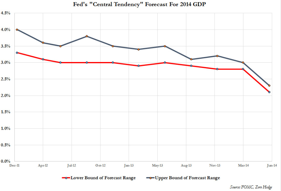
I came across this chart today that shows how FOMC forecasts for growth have consistently started high and proven to be far too optimistic:
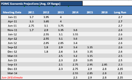
Read each column from top to bottom and see the deterioration — 2013 ended at 1.9%
This chart from Zerohedge shows the deterioration in the Fed’s growth forecasts for this year. After the -2.9% Q1 debacle this week, we’ll need to average 3.6% growth for the remaining three quarters of the year just to hit 2% so you can assume that like will continue to fall.