
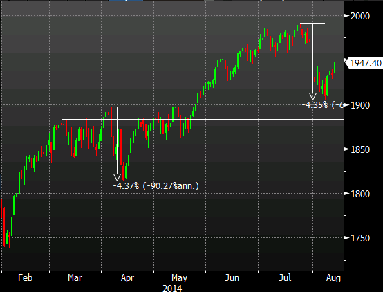
A couple of weeks ago I noted the similarity of the moves around the 1980’s to that of the moves back in March/April as we took on 1900.
Looking at the chart today those similarities stand out even more.
Back in April we saw a 4.37% correction and the move back from the recent high was 4.35%
S&P daily 13 08 2014
One tailwind behind the bounce is the fact that Fed expectations for earlier rate rises have waned. Have they waned enough to see the S&P smash the big 2k though? I fear it’s not going to take much in the way of good data to see the hawks getting excited again, though with data like today’s they’ll be staying in their nests a while longer.
The main jist of my prior post was to highlight the length of time since we’ve seen a big correction of 10%+ and that’s dragged on further now.
Still, I’m not one for trading comparisons as every trade and moment is different but the moves on the chart are pretty striking.
How does that picture look to you?

