
Trading 101
You may have seen and read report that talk about the 'yield curve'. You may know that the phrase has something to do with bonds, but otherwise perhaps you shrugged your shoulders and moved on. Understanding why investors look at the yield curve is one part of the puzzle that investors look at when charting the financial landscape. This short article will help introduce you to the bond yield curve if this is a new topic for you.
What are bonds?
Bonds are simply loans.
The maturity of a bond concerns the length of the loan. A bond with just a 1 year maturity, is a loan for 1 year. Bonds are issued by Governments an companies and they come with different maturities (different lengths). They can be 1 year, 2 year, 3 year and do forth.The general rule is that the longer the bond the greater the risk. This is common sense. It is more risky to lend money for 30 years than it is for 3 months. There are far more uncertainties involved.
The yield curve.
Investors often plot the different maturity lengths of bonds and the different yields offered onto a graph (see the example below). The horizontal axis (left to right) in the charts below represent the length of the time of the bond's maturity.The chart goes from the shortest at the left to the longest on the right. The vertical axis (up and down) in the charts represent the yield offered. The chart goes from the lowest yield at the bottom to the highest yield at the top.
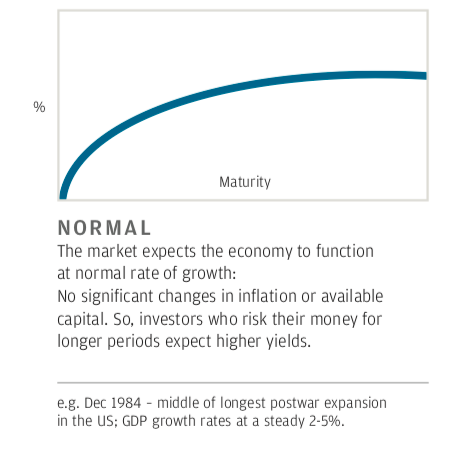
Below is a normal yield curve

The longer dated bonds offer a higher yield than the shorter dated bonds which is what you would expect in a normal situation. For an introduction on the shape of different yield curves see a helpful one page description and intro by JP Morgan here. For more explanations of the bond yield curve you can search for videos on the topic here.
.

