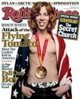
This is the one repeat Olympic performance you could be looking for.
This is chart of the S&P 500 in 2009-10 with the days of the Vancouver Olympics highlighted. The index rose 2.6% during the event and continued to rise through April.
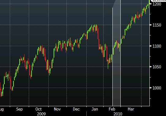
S&P 500 during Vancouver Olympics
Some similarities between that chart and the current S&P 500:
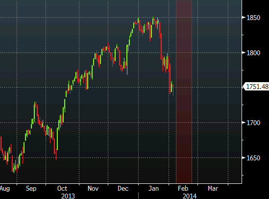
- In Jan 2010, the index had a 9.2% correction in the run up to the Games, the damage this year is 6.0%
- In 2010, the index made a low in July and rallied 29.5% through year-end
- This year, the S&P 500 made a low late June and rallied 18.5% through year-end
- Note the series of higher-highs on both charts in Sept, Oct and near year-end
This is the current chart with over the same period:
For what it’s worth, the S&P 500 also rallied 2% during the Turin Olympics in 2006.
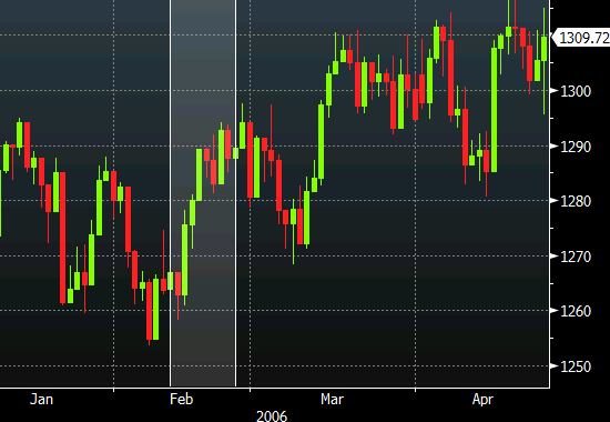
Turin Olympics S&P 500 performance
I would rather bet that the Flying Tomato wins a third gold medal than bet on loose correlations like this but the Olympics are a feel-good event and a distraction for traders. Those kinds of events keep markets quiet and quiet stock markets tend to creep higher.