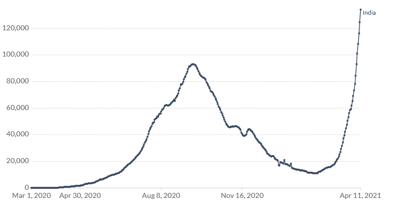
Look at this chart from India

From the outset of the pandemic, one of the great fears is that covid would take hold in a crowded, impoverished place like India.
The country has done a remarkable job of containing it so far but that appears to have changed with the new variants. That is a terrifying chart showing more than 150,000 new daily cases.
There are troubling trends in Southeast Asia as well, with cases spiking in the Philippines.
The question for markets is: Do they care?
We've seen time and time again that the market is able to look through covid and towards vaccines and a re-opening. That's a tough paradigm to bet against. Adding to it is more proof in Q1 that economies are getting better at adapting to the virus.
But geez is that ever a scary chart.


