I cringe when I see analysts using the Dollar Index as an indicator of… well… anything.
The thinking is that it’s a measure of broad dollar strength/weakness. In reality, it’s anything but.
The Index (or DXY) is comically skewed toward the euro. EUR makes up 57.6% of the DXY weighting. Toss in GBP and CHF, which trade at at high correlations to EUR, and it’s up to almost 75%. The Australia dollar isn’t even included.
When the index was formed in the 1970s, Europe had many currencies and now it has just one. In short, the Dollar Index simply cannot be called a measure of broad US dollar strength and weakness.
But here’s the kicker. The original Dollar Index is still the standard, and it works.
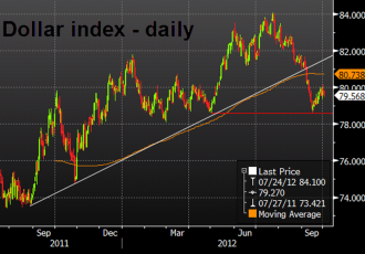
Just look at the chart…

If you search for DXY at ForexLive, the most-recent mention comes from Greg, who showed this same chart a month ago as it was breaking trendline support. Over the next two weeks, the US dollar got clobbered.
Skip ahead to September 14 and if you watching the DXY chart it bottomed at precisely the May lows (red line on chart). Since then, the US dollar is up against every currency except the yen.
It’s uncanny.
So while the DXY might be non-nonsensical if you’re talking about the broad US dollar or trade, it’s still something worth keeping on the radar.
At the same time, here are two alternatives that can also be telling:
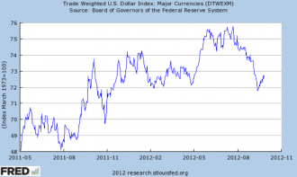
The St. Louis Fed publishes a trade-weighted dollar index. Since currencies are primarily used for international trade, this system makes the most sense. They have a a broad index using 26 currencies and one seen here that uses just 7.

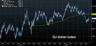
In the summer, Dow Jones introduced a dollar index weighted by currency trading volumes. The idea (I’m guessing) is that capital flows move a currency, not just trade.


